
The 11 August 2013 issue — Issue 1000 — brought a new look to This is True: as promised nearly two years ago, plain text is out, and “simple HTML” is in. I introduced it to the Premium subscribers this way:
A bit of a different look, eh? The redesign of the email newsletter has been in the works for nearly two years, when I finally did a reader survey to ask if you wanted a “simple HTML” version that would make it look better. More than two-thirds of you said yes.
It was a lot harder than I thought to make it look the way I wanted and keep it “simple” so that it would actually work for the vast majority of mail software packages. So I kept putting it off.
Until, that is, we started approaching Issue 1000, and I knew I had to get it done for this week without fail. I couldn’t have done it without my good buddy Leo Notenboom, author of the Ask Leo! newsletter, who is also my tech guru. (Sorry: he’s not available for hire! But you can still get his wisdom on Windows-based computing by subscribing to his newsletter. As it happens, it’s Ask Leo’s 10th Anniversary this week, so congrats to him, too!)
Leo actually drove from his Seattle home to mine here in Colorado and sat down with me to find out exactly what I wanted to do, and then wrote the software to make it happen. As I said: he’s a good buddy. 🙂
The basics were done in just a few hours. But then it was my job to play with it for a few weeks, doing test issues to find out where things went wrong (and of course they did, including a minor glitch today).
And then he revised the software to do what I wanted, and accommodate how I wanted to work, and still output the “simple” HTML formatting I wanted. I think it’s beautiful, and it was all I could do to actually wait until Issue 1000 to show it to you!
Yes, this week’s free edition on Friday will also be the same design. Naturally, just this morning, someone unsubscribed from the free edition with the complaint, “Looking for the HTML version. Plain text is hard to read.” I’ve known for some time that plain text was holding True back.
Font/Size Questions?
From my answer to a comment below — which I’m copying up here with a giant header because several people are asking the same question (tip: this especially applies to Outlook, but not exclusively):
I’m not sending any font attribute — not face, and not size — and the issues have never had font information in them. Font size (and, for that matter, face) is dependent on your settings, and it would be highly inappropriate for me to specify size, since it would be too big! too small! juuussst right! — depending on what kind of bear you are. How you change it depends on where you’re reading it. On a browser (like for webmail), it’s as easy as holding Ctrl while rolling (slowly!) the wheel on your mouse, or holding Ctrl and hitting the “plus” key on your numpad a time or three. (Ctrl-minus goes the other way; Ctrl-0 — zero — resets to base size.) For other things, including smartphones, I suggest Googling the software/phone name and “font size” — e.g., “iPhone font size” — for a how-to.
Again, I don’t send any font information, and never have — ever! And I don’t intend to start now. If you don’t like the font, it’s because you have your software set wrong.
Long Line Lengths
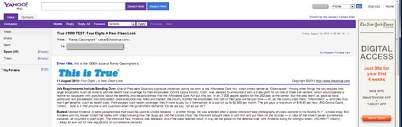
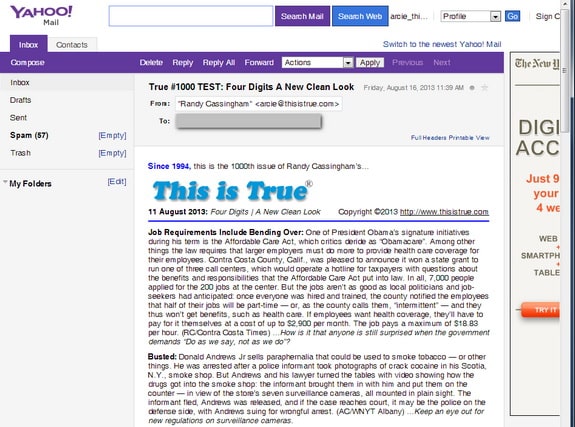
Hugely wide paragraphs are hard to read. This is nuts (from Yahoo mail):
This isn’t rocket surgery. The Interwebs are flexible that way. Also if I shortened the line lengths for someone on a computer, it’d wreck the wrapping for people on tablets, or their phones. So again, I leave such things to your control, which is the proper way to do it!
– – –
Bad link? Broken image? Other problem on this page? Use the Help button lower right, and thanks.
This page is an example of my style of “Thought-Provoking Entertainment”. This is True is an email newsletter that uses “weird news” as a vehicle to explore the human condition in an entertaining way. If that sounds good, click here to open a subscribe form.
To really support This is True, you’re invited to sign up for a subscription to the much-expanded “Premium” edition:
Q: Why would I want to pay more than the minimum rate?
A: To support the publication to help it thrive and stay online: this kind of support means less future need for price increases (and smaller increases when they do happen), which enables more people to upgrade. This option was requested by existing Premium subscribers.
In Bolton in England one of the roads is numbered according to the English convention the A666. When driving along there for the first time a few years ago I nearly crashed the car when I saw a street name – “St Peter’s Way”. I presume the council thought the name and the number would cancel one another out!!!
In high school I worked in fast-food. A customer once placed an order and the total came to $6.66. When she realized this, she added an apple pie to the order. Funny.
Once we fueled an aircraft and gallons came to 666 gallons – he asked us to put just a tad bit more on the aircraft; he was taking no chances.
I work for an insurance company, and part of my job is to pre-authorize services for the doctor offices. The computer assigns an 8-digit tracking number to each authorization and the numbers are issued sequentially.
A couple of months ago, I read the tracking number, 66600000, to the nurse and she read it back to me to make sure she had the right number of zeros. In the background, I could hear the patient telling her to get a new claim number because he did not want that number associated with his healthcare services.
I explained to him that the numbers are issued sequentially and that it would take about a month for us to authorize the 100,000 claims needed to change that number to 667. He canceled his appointment and told the nurse that he would reschedule for the next month.
I just finished the call from the same nurse, same patient, today the system assigned the number 66866601. The patient then informed me that he was canceling his policy with us and would pay for his exam himself.
How many Virginians does it take to change a lightbulb?
Four. One to change it, and three to comment on how nice the old one was.
—
I’m hoping it’s much closer to one preferring the old design…. -rc
I like the HTML version; it looks nice and clean.
You could experiment a bit with the CSS line-height property, which would increase the distance between the lines a bit, making the text more readable, especially if it is displayed with very long lines, e.g. add line-height: 115%.
Good work. I like it.
—
I do want to keep things simple, but I’ll look at line-height. Thanks. -rc
Aw, humbug. But I was in the 1/3 minority. Seriously, though, how about a slightly larger font size?
Congratulations on 1000 issues. That’s truly (heh) a staggering accomplishment.
—
Thanks, Tom. As far as font size, I’m not sending any font attribute — not face, and not size — and the issues have never had font information in them. Font size (and, for that matter, face) is dependent on your settings, and it would be highly inappropriate for me to specify size, since it would be too big! too small! juuussst right! — depending on what kind of bear you are. How you change it depends on where you’re reading it. On a browser (like for webmail), it’s as easy as holding Ctrl while rolling (slowly!) the wheel on your mouse, or holding Ctrl and hitting the “plus” key on your numpad a time or three. (Ctrl-minus goes the other way; Ctrl-0 — zero — resets to base size.) For other things, including smartphones, I suggest Googling the software/phone name and “font size” — e.g., “iPhone font size” — for a how-to. -rc
Congratulations, Randy!! I knew before I opened the email that there was going to be something special about your 1000th edition. And you certainly did not disappoint. Kudos to Leo for producing great coding for you (love his newsletter as well). The look is perfect. Just the right balance between being spiffy and not overdoing the glitz. Here’s to many more issues.
I love the new format. I didn’t have any trouble reading the old one, but the narrow column meant quite a bit of scrolling to read. Kudos, Randy!
I detest HTML emails that change font/color gratuitously, or achieve nothing that can’t be better done in plain text. I also don’t like newsletters that go the other extreme and make something that’s completely not text (worst offender in that respect seems to be my bank). ‘True’ has taken a smooth step into incorporating images and a bit of boldface, plus a few divisions and such, and I think it’s an improvement over the text version.
It looks beautiful Randy, I just love it, Congratulations on 1000 issues!
I like the new format… It is easier to read. I just renewed my subscription to the premium edition. I think that it was time for an increase and will renew again… and again. Congratulations on the 1000th issue. I hope that we are all still here for the 2000th.
I really do not like what my computer is doing to the format of your new newsletter. Very small font and long long lines all the way across my screen. I needed to copy and paste on my Word program so I could read it. I don’t know how to change it on my computer though so I guess I will continue to copy and paste so I can read it.
Love your column and wouldn’t give it up for any changes whether I like them or not. Thanks for all your work.
—
That’s pretty odd — haven’t heard that one before. Pop me an email that says what email software you’re using, and I’ll see if I can offer any suggestions. -rc
I just wanted to compliment you on the new look, and as many others have said the price increase is no issue and I hope your revenue problems are alleviated. Also, and again as other have said, when renewal time comes up I will be looking for the box to add to the subscription payment.
—
They’re alleviated in the short run. Time will tell for the long term. Thanks! -rc
I love the new format and thanks for the compliment in Tagline Challenge write-up — try not to be a slouch but apparently I DO have weak bones, broken my leg 3 months just tripping. Looking forward to reading Issue 1001 when I get back from my holidays.
—
Watch your step! -rc
Lovely.
—
Minimalist! -rc
I LOVE IT!
Score one “LIKE!” for the new look! Keep up the great work.
The new format looks great on my smartphone. Thanks to you and Leo.
—
Indeed, one of the drivers for me was the increasing numbers of people reading on their phones and tablets. I hated the look on my phone. Looks great now. -rc
One small little note: I like the ‘simple HTML’ format, but the method of linking to the ‘latest Jumbo Joke’ does exactly that, it links you to the latest joke, with no possibility to go back to the ‘Jumbo Joke’ main page and see the others for the week.
I was accustomed to clicking on the link, and being taken to the Jumbo Joke main page, where I am offered the latest joke(s), then clicking on one to read it, then using the back button and so on. Your new linking prohibits such.
It’s not a big thing, but perhaps you might link to the Jumbo Joke main page, not the ‘latest’ joke in future.
—
Not at all: there’s all sorts of navigation on the joke pages. First, the “Jumbo Joke” logo in the upper right will take you to the Home page. Second, at the bottom (under the mailing list signup form), there are links to the Previous item, Home page, Random joke, and Next item (if any). Third, under that, there’s a listing for each Category that the joke is filed in, with a link to the Category listing, the Previous item within that Category, and the Next item in that Category. It’s all extremely user friendly, but you do have to look for the features to see them! -rc
The new format looks really good.
I’ve loved your posts for a long while now and I’m happy that I upgraded to Premium some time ago.
Keep up the good work.
WOOHOOOOOO!!!!!!!!!!!! Batting 1.000!
Congrats on a rare medium well done!
—
Homage to Fred Allen? “You know, television is called a new medium, and I have discovered why they call it a medium: because it is neither rare nor well done.” –Allen, on the premiere of “The Big Show” (1950) -rc
Looks great! I love how clean and easy to read the new format is.
The new look is fantastic. Understated elegance. I patiently await my notice to resubscribe so that I may upgrade at the new price. ^_^
I like the new format, it looks great. And congrats on the 1000th issue.
Congratulations on 1,000! As for format, I love the crispness of the page, but the wider format does make it harder to read. Solved the width issue by opening an information window in Eudora and making it wide. This allowed me to pick my own width. Work arounds are great. Anyway, keep up the great work.
—
I still use Eudora too (for more than a decade), but I have no idea what an Information Window is in that program! -rc
I had to do basically the same as “Suzann, Merced, CA” — the very long lines make it difficult to read.
The first try was reduce the width of the window — I have a *very wide* monitor at work. This still was a pain, so I did the cut/paste, but the special characters (like quotes) are trash character sequences (the effect of the HTML sequences being turn into text).
I would talk to your guy — it is possible to define the font size (at least I see it done all of the time).
I hate complaining on your issue 1000. I guess I’m just an old fart who likes text. Congrats and many more issues to come!
—
Please read the font section. I can send font information to satisfy you, but I guarantee it’ll make it worse for the majority of others, which is why I won’t do so. -rc
The new look is great! Not a massive change, as it is still easy to read text, but allows for the inclusion of the occasional graphic rather than having to link to them as before. I would imagine there are few, if any, email readers still around that do not support HTML so it is a welcome upgrade. Many years ago, when the opposite was the case, a friend of mine had as an unattributed signature at the end of his emails; “HTML in email is for those people who still consider crayons to be an integral part of the communications process.” Of course, back then, those who did use it tended to go overboard and throw in whatever colours, effects, and graphics they could regardless of whether the recipient was able to see them. I’ve grudgingly come around to the idea myself, but still prefer good old words unless something more is essential.
Congratulations on the kiloTrue issue (as we would call it here in metricland)!!
—
That you still seem to be an HTML curmudgeon, yet still think it’s “great!”, is a terrific testimonial to the balance I was looking for. Thanks, James! -rc
Absolutely perfect!! Great look. Enjoy every issue.
Congratulations on the 1000; I’m looking forward to at least another 1000.
I like the new look, and think you and your friend Leo did a great job of balancing it.
Best of luck and increasing prosperity to you!
I love This Is True and you just went and made it better. As tired as I am, I have read this issue twice and laughed more than once. Thank you for stretching a stiff mind.
I can’t say I like the html version of TIT as my email program mangles it, (every time there is a ‘or ; or , or : …. it adds a space before the symbol which makes reading difficult. I’m fine now as I found the “plain text” converting link on the top of the page. Here’s hoping few others email programs are mangling it!
In case you are curious, I am useing DreamMail on a Win 7 64 bit system.
PS: I LOVE TIT!!! Hope you are around to pen issue 4000!!! (and me to read it!!)
—
Well, at the current rate, that would be more than 57 years from now. I don’t think I’ll be doing it then. But yes, the “MIME” issues include a plain text version for those mailers which can display it. We may fine tune that look, too, as time goes on. And yes: I was curious! -rc
I, too, was in the minority on the format survey, but you’ve made me a believer. (Uh-oh, does that make me immoral now?) Unlike the earlier poster, I greatly appreciate the new link to Jumbo Joke.
—
Glad to have another convert. 🙂 -rc
Hate the new format. I find it so much more difficult to read. Probably end up skipping the comments section from now on, after struggling through the news stories.
—
Are you reading it on your browser with webmail, or downloading it to a mail program on your computer? (Send me a note by email, please, including what email package you’re using, and what makes it difficult to read. Thanks.) -rc
I do totally get the too-big/too-small/just-right conundrum… but, by the same token, I must echo the concerns from Suzann of Merced. My own solution to the long-lines issue was to shrink the browser window size so that the right edge of the text roughly met the right edge of the word “Premium” at the very top. That let my eye bounce back and forth with about two saccades per line instead of three or four, which (for me) made all the difference as far as readability. Changing the browser window size is ok for me, but I’ve never had to do so before (with other email newsletters that I actually read).
Interestingly, my initial gut reaction was also that the font size seemed “too small”, but once I changed the browser dimensions, the same font was fine, and I also checked to see that it was in fact identical with the prior (#999) issue. Exactly what you’d expect, since you’re not specifying its size.
So, I guess my personal vote would be for a fixed width of somewhere around 450 pixels, and not changing anything else about the very elegant design… but I do understand that you’re never going to be able to satisfy everyone!
—
Right. And 450px may make it horrible for phone reading, for instance. -rc
Congratulations on 1000 issues. I’m looking forward to many more.
I like the new format, but would like to suggest one change: Can you please make the paragraphs auto-wrap so that they will still fit entirely in the window when I make the window narrower. I know it’s a matter of taste, but I would prefer the lines shorter.
Thanks for a great publication.
—
Wrapping is a function of your software. The paragraphs definitely wrap in every software we tested it on. -rc
When I opened this issue I definitely had a WTF moment. My email app (Apple mail) in full screen made each story 4 lines long and about 50 words to a line. Not the best for reading, but a quick play with Ctrl + got it back to the way I like it.
I also loaded it up on my tablet and phone to check. Once again a quick zoom in or out got it just the way I wanted. Good job Randy!
Great format. Huge improvement on the plain text which was never formatted correctly when reading on my iPad. Your instruction in comment three also helped to teach me a little about how to alter my reading experience and alleviate the problem I initially found with small text. Aging eyes….
Now the format matches the high satisfaction levels of the content.
Thank you and keep up the good work.
The new format will take some getting used to (but then, I’m STILL getting used to how things in general look on the monitor I bought after the old one died a few weeks ago), but I like how it looks. As long as you keep it “simple HTML” I’ll have no complaints. Too many places online feel the need to use all the fancy shmancy HTML things they can, but that don’t really do anything to improve the content.
I’ve only been a Premium subscriber since August 2005, and free for who knows how long before that, and wish I’d discovered True sooner than I did. Keep up the good work!
Great new format, I was routinely pasting the plain text into word to make it easier to read. 1000 issues, time flys.
I’m very happy you made the change — thanks!
Regarding font size. You are right, you shouldn’t be specifying font size. The new version looks great on my Lumia Windows Phone. However on my PC’s wide screen the font seems is a bit small and reading across the whole screen is tiring.
Although I personally can zoom (so I can lean back and then not have to move my head/eyes back and forth so much) or reduce the Window size, it might be a good idea to add a font size button to make it easier for folks who are not used to doing this.
See example here — top right (A A A).
See this page for how to do this.
Just my two cents.
—
The problem is, that’s far from “simple” HTML, and is guaranteed to cause trouble in most email software. And why should I risk that, when virtually every mailer already has a built-in function to adjust its display font face and size? -rc
Love the look! It’s amazing what you can accomplish when you collaborate with friends.
Great job, I’m glad I got to be part of issue 1000. Congratulations!
Love the new format — finally moving into the 21st century. I have been enjoying your stories now for several years and this improvement makes it just that little bit more enjoyable. Don’t let the whingers get you down. You bust your hump with this newsletter and nobody is forcing them to read this. Good on you.
Love the new format. Easier to read and adjust to size. Congrats on the 1,000 editions. Keep them coming.
“This is True” just gets better and better. What do you have planned for #2000?
—
Direct mind insertion. But I hope I don’t have to wait quite that long to accomplish it! -rc
Over the last few weeks as you have been teasing us about something new with issue 1K, I was suspecting — and hoping — it was the HTML. So hurray!
A minor issue: there is a lot of horizontal space between the bullet points in the tag line challenge responses. I suspect there is a ‘br’ tag after each ‘li’, but the ‘li’ tag causes a line break at the end of each bullet point.
All told, a great present to your readers to celebrate your 1000th.
—
That spacing is completely dependent on your software, and most don’t put in space automatically. I can’t keep it simple and control what every reader sees. -rc
I for one am among the majority of commenters who are fully in favour of the new format. I typically read TRUE on my phone when I wake on a Tuesday morning in an effort to have my brain a little more turned on than is typical on other mornings, and the email client on most of my phones hasn’t done a good job of rendering the old hard wrapped format.
It was a real treat to open the message this morning and see what you (and Leo) have achieved. Thank you!
I love it, but whoa did I get a scare. I opened my email first that said True was cancelled. I almost cried. Then I said, well Randy and his crew would Never do something that was not listed in his newsletter and WOW was I in for a surprise. I love it. It is easy to read. Looks updated “a new medium”. And there I noticed the recurring has been cancelled so I can upgrade at the new pricing, which I definitely had intended to do. Congrats to everyone on the hard work for making True 1000 issue. May it continue for another 1000!!!!
—
I had also noted in previous issues that it was likely I’d have to cancel the recurring payments, since neither Paypal nor Amazon had a way to change the price once signed up. Sorry it’s a pain. -rc
I have to say “Ick!” to the HTML format. It’s largely unreadable on my portable devices. Yeah, I expanded the size, but that doesn’t re-flow the text, so I’m continuously scrolling left/right to read the lines. With the text format, the text would flow no matter the font size.
So, I just read it on my computer (which I’m using for this comment, too). Even here, the font shows as much smaller than all my other email.
So, you can count me among the multi-year subscribers who don’t like the switch from text to HTML.
—
PLEASE read the comments here. The flow problem and font size is completely dependent on your software and settings. You can fix it if you choose to. I cannot. I see you’re on gmail: it looks perfect in mine, no matter how wide or narrow I make the window. Gmail does display it correctly if your settings are correct. -rc
I just wanted to offer my congratulations on the 1000th issue. A true milestone in any venture of this kind. “This Is True” has always been more than just a fun break from the monotony of the daily rigors of life. It has been a unique forum for intelligent, though-provoking and rational discussions on that life. I am happy to be able to continue supporting your work through my subscription.
I didn’t mind the old version. The format gave the impression there was a lot of content — all that scrolling. The new version, however, is GREAT! And a hearty congratulations on 1000. Kudos.
Looks great, and congratulations on hitting four figures!
Congrats on 1000th issue & love new look.
Enjoying every issue. Thanks for making my Tuesday interesting & fun.
Love the new format and congratulations on 1K! I’ll definitely renew when I get the renewal notice.
Congratulations on 1,000 issues. Well done!
And, I love the new look.
LOVE the new look to True!!! I find it much easier to read now; it’s a much better layout for these “not getting any younger” eyes of mine. *grin*
Keep up the great work, Randy!!! 🙂
The new format is great. However, contrary to one of the comments, I preferred scrolling down with the shorter line widths. You (and/or Leo) did another thing right: when I minimize the screen in Outlook and tinker with the width, I can get a good combination of less scrolling and not losing track of which line I’m on with the full screen. (There’s a reason newspapers use multiple columns). Along with another commenter, I have trouble with the MUCH longer lines.
—
If you make your window narrower, they should get shorter. -rc
Love it! Looks great…simple and professional. Clean.
Home run! Since my eyes are 20 years older than when I first started reading “This is True” the new format is a relief for us. Love the new format, you kept it simple without distracting page breaks, ads, and other interruptions. Looking forward to issue #2000!
I love Love LOVE the new format! Not just because it looks better and you can highlight words and the HTML links actually work and you can see the headings clearly and so on….
About 3/4 of the time, I read True on my cellphone. It used to be that every pain-text line would wrap onto two lines, so I’d get long line, short line, long line short line, with inconsistent indent levels. Now, for the first time, line wrapping conforms to the screen width, whether I’m in portrait or landscape. The indent levels actually work now! It is SO much easier to read this way!
Thank you, thank you, thank you!
Yo yo, homey!!! Congrats on issue 1000. I think I first subscribed to the free edition back in 1997 or 1998; I am proud to have moved on to the Premium level a few years ago.
Thank you for providing a good, honest laugh and a wry perspective on life and people. Many, many more happy years publishing!
Thanks again, Randy. With apologies to Franklin: “Nothing is certain except death, taxes, and a hearty ‘This is True’ laugh every week!”
Great job on the HTML issue. Looks a lot nicer. And congratulations on the 1000 issue milestone!
one word…
Beautiful.
I love the new format. It’s clean and easy to read. Looks more modern and friendlier too. Thank you! And congrats on 1000 issues. I just wish I’d discovered True years ago.
LOVE the new look of True! I usually read it on my Ipad, and it looks fantastic now!
Keep up the good work.
Thank you for your dedication to this newsletter.
Congratulations on 1000. Kudos on the new look. Just enough HTML and thanks for allowing the user/reader to set text display to personal preferences.
No problems with the newer price. I had to raise my rates a while ago too.
Keep on truckin’.
Congratulations on this milestone edition. I hope to be around to see the next set of triple 0s turn over.
I’m glad to see that I was in the groups that approved of both the HTML and subscription price changes and that the response of your readers was greater than you hoped for. The changes you have chosen are “juuussst right” as far as I’m concerned.
Thanks a bunch.
LOVE the new format. However, I loved the old format. I don’t care how you send it to me, as long as I get it every week!
Congratulations on 1000 issues! Now let’s look forward to the 10,000 mark!
Great job to 1,000. I haven’t been on board for all of them, but have loved the last 5-6 years. Also love that you knew Fred Allen’s comments on TV. You’re no medium medium, in my book!
—
Fred Allen was a great wit, and died too young. -rc
I just finished reading issue #1000. Once again, you’ve increased the value of True with this little change. Thank you for wanting to stick around to entertain us. Great job!
I am one of the last of the techno-Luddites. I don’t use HTML mail (unless it is forced upon me), but I love, Love, LOVE the new and improved plain-text look! Please, please, please continue to support plain-text email.
And yes, lest anyone wonder, I’ve been a professional computer geek for over thirty years, so I am not one of those “can’t understand this new-fangled HTML mail” guys. I can understand it, I just don’t appreciate it. So I am pleased that everyone who thinks “the new HTML-ized version of the newsletter is great” is happy. But I am equally happy that I am not forced to read the HTML-ized version. I’ve unsubscribed from a number of mailing lists when they went to HTML-only, or worse yet, to HTML-lamely. If you want to understand what I mean by the latter, see this post.
Though the discussion quickly veers off into the weeds (as they often did, on that list).
So thank you, Randy, for producing an RFC 2046-compliant email, and for (IMNAAHO) improving the format of the plain-text part, too. 🙂
—
Glad you like the text version that’s included too. But more than that, I’m glad that if it’s what you want, you have the right software so you can see it! -rc
Just this: I am so happy.
—
Glad you like it, Roberto. -rc
I am a little behind in reading the new format as I am retired and am no longer chained to reading email each day. I do have trouble reading the new HTML format. As some have said, the lines are too long and my eyes have to carefully follow across the entire page, then find the next line down with difficulty. This is true (no pun) even after pressing CMD + three times on my iMac Pro 17″. I had been enlarging the old text three times before as well so font size is no issue for me, just the long line length. I am reading this in Apple Mail, BTW.
Base on Timothy in Seattle’s comment above, is there another way to read the message?
1000! WOW.
—
I’m a little boggled by the complaint that the lines are too wide on gigantic monitors. How about making the window narrower?! You don’t have to keep your programs full screen, yaknow! Anytime a web page or email is “too wide”, I just drag my window narrower. It’s not a big deal. As far as what Timothy is doing, he has a very capable email program that lets him read the “alternative” part of the MIME message. It’s way beyond the scope of a publisher to tell you how to do that. And if you have no idea what I just said, you’ll get the idea of why. (But that’s truly enough for some to slap their foreheads and say, “Of course!”) -rc
I’m liking the new format. In scrolling through the comments to date, I don’t see HOW to change the text size, so I’ll give the trick that I use: Hold down the Ctrl button and scroll with the mouse roller. It automatically changes the magnification of the html page. I hope your readers find this a handy trick!
—
I discuss that in the “Font” section. It’s definitely a good trick. -rc
Congrats on 1000 issues! Love the new look of TRUE — crisp,clean, and easy to read.
Since my vision is deteriorating (cataracts), I constantly use the “Text Size” button in Outlook. “Zoom” also works nicely for some pages. Not having predetermined font sizes is a good thing.
Congrats on 1000 issues!
I too do not like the long sentence structure. I read my
version in the preview pane of my email, not in my browser,
and I shouldn’t have to adjust my reading pane to fit one
particular email over another. Standard protocol is to add
line breaks anywhere from 60 to 80 characters per line.
Otherwise, great new look.
—
It’s standard protocol to break plain text, Courier-face text at 60-80 characters, not proportional type, which looks horrible when line-wrapped by how many characters in a line. For instance, here is a line of 60 lower-case Ls, followed by 60 upper-case Ms:
llllllllllllllllllllllllllllllllllllllllllllllllllllllllllll
MMMMMMMMMMMMMMMMMMMMMMMMMMMMMMMMMMMMMMMMMMMMMMMMMMMMMMMMMMMM.
See why proportional text is not wrapped by a specific number of characters? I wrapped your comment at your suggested margin of 60. How does it look compared to everything else? -rc
I’m glad to see plain text still works. My mailer does not display HTML for security reasons. It’s turned off. While I trust you, you can be spoofed, so I’m not changing it.
Love the new look, great on my email client, and on my phone. Good job!
The new look is awesome! HTML makes my favorite Friday This Is True email that much more enjoyable to read. And don’t worry about font issues for me. I have Thunderbird set to use my own font sizes/styles. Ain’t tech wonderful?!
Keep up the great work. Looking forward to #2000.
I’m not sure how I feel about the new look, but I figure after a few issues I won’t notice the changes anymore.
I do wish you would specify a fixed width for the line length, though, because I really shouldn’t have to screw with my window size every time I want to read only your emails. My browser isn’t even full screen, and the lengths are a bit too long. I actually have my browsers set at the less than full screen width just to make reading on the web easier, and they are at the perfect size for a very large majority of sites I visit.
If there aren’t enough people letting you know that they don’t like the line width to change your mind, well, I guess I will have to deal with being unhappy with one thing.
Oh, and my monitor isn’t gigantic compared to most new monitors now, it is still large, but not huge at 20 inches.
(Fitting it at the width that the comments show up here would be perfect.)
AND!!! Most importantly! Congrats on 1000!
Another thumbs up for the new look. It’s easier to read. And congratulations on the milestone!
Excellent changes to the format. I like it. Long overdue.
Nice
—
Minimalister. -rc
OK, I get why you made the change the way you did. It still doesn’t change the fact that it’s hard to read and I can find no way of changing the way it’s displayed in my email program. It would be nice to have a link to an online version so we can use CTL/+ to enlarge the font. Jumping through hoops like copying and pasting into Word and all that is a little much.
—
Yes, that’s silly. Look at the scores of people who say it’s easier to read, better looking, etc. So are they all wrong, or is the problem at your end? I gave you tips on how to fix your software. And there is an “online version”: there’s a link in every single issue. Is it really too hard, when it’s your goal to read this, to pay attention to see what the resources are that are offered to you to help you accomplish your own goal? THINK! -rc
Yes; it’s nice. Well done!
Great new email format. 1000th is a big number. Although I hope to read your email much longer than this.
“How to fix this? Drag the window so it’s more narrow! Really: your browser doesn’t have to be full-screen. The text re-wraps to accommodate the narrower window. Easy! And isn’t this a lot more readable?”
Or, you could use a simple html table command or something similar to limit the width of the column in all email clients, instead of expecting us to change our preferences to accommodate your newsletter. Love the new design (and the newsletter!), but accommodating users’ needs rather than expecting them to adapt to your approach is a basic tenet of usability. Thanks!
—
I’ll look into it, but if it makes it better for the minority at the expense of the majority, I’m not going to do it. That’s a basic tenet of customer service. -rc
Love it! I wish everyone would let me see email in the font I choose. My first thought when I opened your email was — “Beautiful! Love the font!” Thanks for letting the reader see things the way s/he wants to see it.
For font settings on Mac OS X —
Thunderbird: Preferences – Display tab
Mail: Preferences – Fonts & Colors tab
To change line length, change the width of the window.
On my iPhone (first-gen, from 2007, so really old indeed) the text doesn’t reflow and I get horizontal scrollbars, probably because the bottom table (with your address and subscriber options) has a fixed width of 600px. If I resize my desktop mail client (Mail.app) to less than 600 px, I also get horizontal scrolling. If I resend the mail to myself without that bottom table reflowing works on my phone.
Holding my phone sideways is just wide enough, and assuming my phone will probably be upgraded before my eyesight goes worse, my Saturday morning routine of reading a fresh copy of the free edition before getting out of bed is not disturbed.
Just for fun, I looked up the first edition in my mailbox: May 30, 2004, with “at least 21 [readers] in the .zw domain”. Hmm, ten years of free riding — maybe time for an upgrade? But will it arrive on Sunday or on Monday mornings in the EU timezones?
—
First, I’m surprised and disappointed that my distribution company is adding a fixed-width table to the bottom! I will complain to them. If they really need to add a table, I have no idea why it would be so wide, for an insert that is so small. Second, Premium is sent in the evenings (USA time) each Monday. Belgium is 8 hours ahead of Colorado, so I presume it would arrive very early Tuesday mornings. -rc
I’m a computer professional, but still a curmudgeon when it comes to email, preferring text over HTML most of the time. However, as I’m reading email on my phone more often now, it’s becoming less of an issue. I’m glad to see you’re doing HTML right; that is, minimally.
That said, I was curious how True looked as text now. I’d say you still have some work to do there. For one thing, the line widths are occasionally inconsistent, and I don’t just mean the ones with lengthy URLs. But worst is the ALT text for some images that say, “Enable images to see header” (or “graphic”). That’s just plain insulting to any blind readers you may have! The logo’s ALT text should just say, “This is True.” Other ALT text should either say what the graphic says or briefly describe it.
I appreciate all the work you’ve done trying to get the new HTML format right. Focusing on the HTML was the right thing to do since that’s what the vast majority are going to see. But I hope you’ll spend a little more time on the text version to get it right.
—
Not one of my many blind readers have complained; the one I have heard from was very complimentary. The text version is created automatically from the HTML version by the service provider. I have no way to adjust their algorithm. -rc
Great new format. Keep up the good work!
I also was in the non-html camp, but have to admit you did a really good job. As a software developer I believe in appropriate use of technology, and your use of html seems to me very much to fall into that category — no bells and whistles or unnecessary frills.
One suggestion I do have about the html: add classes or ids to the top-level HTML objects, like BODY. This way users could easily write (and share!) css customizations for things like font size or page width which should be respected by any reasonably modern mail program or browser.
—
Most of the readers who are complaining can’t fathom how to change the default display font on their programs, and you think they’ll be able to share style sheets, which email programs implement inconsistently? You’re much more optimistic about that than I am! -rc
+1 for the new look! I generally detest HTML email because of the overdone gratuitous changes of font/color/style, but you have gotten the best of both worlds by KISSing. (That’s “Keeping It Simply Straightforward” — having seen you at Mensa gatherings, I know it’s not “Keep It Simple, *Stupid*”.) Just enough splashes of color to brighten it up, and just enough changes of styling to distinguish headline, body, and punchline. Well done! Maybe you could publish an HTML Email Style Guide, to educate people like you do with your Spam Primer.
—
I’m busy enough that I’ll just say, “Don’t hold your breath!” -rc
The new look is great … Alllmost perfect, but perhaps spell check would help!
Seriously, thanks for alll the hard work!
—
If you notice any typos, that’s what the errata page is for! -rc
I like the change. I even noticed it before I read the fact that it was changed. Ready for 1000 more? I am!
I love the new format! A big thumbs up to you and to Leo (whose newsletter I’ve received for ages and from which I’ve learned very much).
It’s clean, easy to read and still all that we’ve all come to expect from This is True.
I have no idea what anyone here is talking about.
Too big, too small, too narrow, too wide. Lines wrap, or don’t. HTML on or off?
Gobbledygook to me.
So, just THANKS for the 962 issues I’ve read, and thanks also to all those paying subscribers who help this poor lady make it through another week.
Congratulations on #1000. The change in format is grand. I was not expecting such a drastic change but it really is wonderful. Welcome to the 21st century. Looking forward to the next 1000 issues.
I like the new style!
I like the new look. Simplicity is wonderful. It displays well in Mozilla Thunderbird.
Regarding this exchange from above….
“Congrats on a rare medium well done!”
“Homage to Fred Allen?”
I do believe you meant to ask if Charles were “Channeling” Mr. Allen….???
—
A worthy amendment. -rc
Wanted to let you know the new look is so much easier to read and on my eyes than the plain text which has been used for years. Thank you so much for the change!
Oh, and by the way…
Leo Notenboom is the Man! 🙂
—
Yes. Yes he is. -rc
Great. I love the new look.
—
Doc used font attributes to make “Great” look big — and red. But the comments section doesn’t allow such grandstanding. Sorry, Doc! -rc
Like new layout much better and so do my “getting old” eyeballs. Have been getting Ask-Leo for years “think you turned me on to him.” Great guy. Did not know I had control over fonts in newsletters, Yours are perfect now but so many others are hard to read. Will be learning that trick as soon as I post this. Thanks for the info and the great new page setup…you do good.
—
And with computers, there’s always more to learn. -rc
Congratulations on the 1000 issue milestone! Great job on the HTML issue. Looks a lot nicer. I wish I had found out about ThisIsTrue long ago; I missed 900-some issues.
—
You can still get the old stories in the books. My assistant is busily getting them ready for print. -rc
I think the new look is great. I can read the stories without straining my eyes.
Love the new format. Just had to go and upgrade! I have been on premium before but just keep neglecting to re-up when I have the money. Cannot wait to see how the premium issue looks in the new format.
And aside to Chuck in Lakeview: The books are awesome, My mom has some I got my dad before he passed, and has had to hound my brothers, sis-in-laws and nieces and nephews not to run off with them. Two of them went all the way to Baghdad with one of my cousins, and returned a little dog eared.
I REALLY like the new version. It is so much easier to read.
I love the new look. Font size is no problem — all I have to do is hit Ctrl and + and immediately got a bigger font.
Been a free subscriber for years; have now given the premium a go.
No problems getting emails on PC but can’t get content on my Samsung Galaxy 10.1.
This has only happened in the last couple of weeks.
Is there a reason for this???????
Always been able to open up on my tablet before.
—
My wife also has a GalaxyTab, and Friday’s issue looked perfect on it. -rc
Random Thoughts…
“Congratulations on the kiloTrue issue (as we would call it here in metricland)!! From James in Toronto”
Congratulations indeed on your fourth digit, and welcome to the HTML age, but you’ll need another 24 issues before the software geeks will call it a kiloTrue! 🙂
I had gotten used to reading it on my mobile “dumbphone”
which used
a line width that was 90% of what you used to set line
breaks at.
(If those html tags show through, don’t bother fixing them, it will make the point just as eloquently!)
The only problem I saw was that the logo did not appear in the header, probably because my mailer picks off attachments.(Guessing).
Overall impression; Cool! But I just got a new smartphone at the same time as this changed, so cannot really compare.
As regards Darrel of Indiana’s complaint about a space before punctuation marks, this could be an encoding issue; Switching to and from Unicode does that on my computer, but that could be because I use non-English fonts as well — might be a clue.
In reading the teasers for issue 1,000, I was 99% sure that we were at long last going to see an HTML issue of True.
Hallelujah!
I had two first thoughts: 1 – Aweber has hundreds of HTML templates, many with a very simple and clean look, so wondering why go to all the trouble to build something from scratch? Yes, only 98.5% of your readers would be happy instead of 99%, but….
2 – You often mention that your readers are smarter than the average bear. I think we (your loyal and occasionally fickle readers) are wise enough to know that the advertisements are ads. The notification that what follows is an ad, by writing the word “Advertisement” above the box with the green double border, seems superfluous.
LOVE the new true, glad it’s finally here.
(And for Outlook 2007 readers who want bigger text, it’s Ctrl + mouse scroll, Ctrl + Plus Key doesn’t do it.)
—
1) Because I’m very particular: I want it to look the way I want it to look, and then get there with an absolute minimum of formatting codes (which can break!) 2) The word “Advertisement” is a link — it’s a solicitation to those who would benefit from buying space (try hovering the word with your cursor!) -rc
Although I consider myself quite a plain text fetishist, I almost like the new format after just one edition 🙂
BTW: My obsession with plain text was reinforced a long time ago when I met a blind person using a computer and I realized how he struggled with all that graphical stuff. I hope the supporting software improved in the meantime; back then under Windows 3.1 it was a royal pain in the lower spine to get it work. (Did I just give away what an old fart I am?)
I read with great interest the comment of your reader about the ALT-text. Do you provide an ALT-text with each image? (My email service might throw them away or I made a mistake when searching for them in the HTML source.)
Keep up the good work.
—
As noted in a previous comment, my blind readers are not having trouble with it. And I do try to remember to always put in Alt text on images. -rc
Congratulations on your 1000th issue. I have been enjoying your humor and information very much, don’t remember how long, but it has been entertaining. I like the new format, it will take a little time to get used to it but it is AOK. Don’t forget the worst eight words are: “We never used to do it this way”.
Regarding line lengths, I’ll admit I found them annoyingly long yet I didn’t think of narrowing my browser (or, in my case, the reading pane in my webmail) until it was suggested here. I’ve rarely had line-length issues anywhere else and I guess I’m too used to maximising my windows. ‘Only’ a 1280×1024 resolution for me, which suggests line length issues won’t just arise with giant screens.
So I do think it would improve usability for many readers to set a maximum width; it’ll still narrow and reflow for small screens, but won’t get silly on larger ones. Of course anybody who WANTS long lines will be out of luck, but I doubt there are many. I believe this would be a simple bit of CSS, though I don’t know to what extent browser and mail client quirks will complicate things.
Your current email does do well in avoiding horizontal scrolling with narrow windows, something most of the ‘big names’ don’t manage, so props for that. And, of course, 1001 issues of True. Roll on the 20th anniversary and beyond!
I’m puzzled. If you have never specified a font size in the newsletter why was the text format so much larger and easier to read than the HTML format? Also the text version never had long lines like that.
You never told us what the reason was that Outlook sucks. I control scroll to change font size in Outlook all the time. I do wish Outlook had the option to read HTML text in the same size/font as specified for plain text.
Overall the new format rates a 9.7 out of a possible 10.
—
Because plain text generally doesn’t “flow” (have a way to re-wrap the paragraphs), it’s standard practice to break the lines manually at less than 80 columns. That looks like hell on tablets or phones, because the broken lines are then broken, and you end up with alternating long and short lines. The font depends on what’s set on your computer/software: it’s typical to have one for “styled” (aka HTML) text, and another for “plain” text.
As for Outlook, it’s commonly known as a problem program, with high susceptibility to being a virus conduit, crashing and losing all your mail (because it’s kept in one huge file), and such. Maybe “the latest version” would be better? Well, here’s an example of a note I got this evening:
The bottom line is, it’s impossible to put in enough exceptions so that it works for everyone — even if I chose to abandon “simple” coding. -rc
And if I’d remembered what you’d written in your email instead of forgetting it when I read over the comments here, I’d realise you’d done more or less what I was saying…
For whatever reason it’s not worked in my email client, Plusnet Webmail. Taking a poke at the source, I see that the body tag in the email as you sent it, where the 600px width is specified, is not in the source of the email frame in my webmail. Whether this is correct or non-standard behaviour by my client I don’t know.
—
Gmail handles it fine. Even my ancient copy of Eudora (last updated in 2006) renders it correctly. Yahoo, on the other hand, simply ignores the width command. I’ve never even heard of yours. -rc
I did know about opening my email to the width I wanted to read what I wanted, but had no idea I controlled my font size!! I was sort of going blind reading the newsletter but loved the new format so much that I wasn’t going to say a word. All fixed now and I can read all my emails better. You are the best! Thanks.
—
Glad it helped, Kathy. -rc
Have you looked at your newsletter in various smartphone email apps? In the Gmail app for mobile your newsletter is effectively unreadable. The text is microscopic, largely because of the huge line width, which forces it to be scaled down.
You might not be sending font size info, but by forcing long line breaks you’re creating other unintended consequences.
This is one reason that people use specialized email providers or template designers (like those from MailChimp, for example) to deal with email distribution for them — because they optimize templates for a wide variety of devices and formats so you don’t have to. (Note: I’m not affiliated with MailChimp in any way — I just have managed a lot of email marketing lists in the past).
Frankly, I think it’s a bit condescending of you to tell your readers that they should modify their behavior in order to fix a problem that better design could have obviated in the first place.
No one expects you to be a UX expert, but you’re selling a product that happens to come in text format — so that happens to be your “packaging”. If a product has crappy packaging, you don’t see manufacturers telling people to unwrap and rewrap the product themselves to make it more attractive or usable – the company fixes it in order to sell more product.
You’ve got a great product, but now I’m having a very hard time consuming it… and my first instinct isn’t to put down my preferred device (mobile or tablet) and instead fire up a desktop browser and mess around with font sizes until I overcome your design’s shortcomings. It’s much easier to just stop consuming your product, which is a shame.
—
I don’t have a lot of phone email apps, but I certainly have Gmail (Android), and it looks fantastic there — and the same font size as everything else that comes in. The lines wrap perfectly, and change if I turn the phone from portrait to landscape. I can’t believe your difficulty is anything more than your settings. ESP templates tend to be hugely bloated and difficult to work with. This is True, by the way, is quite a bit older than every ESP in business; I’m not someone who doesn’t have a clue here.
I’m finding that 98% of the readers are having no difficulty whatever. Less than 1% is using hugely obsolete software (obviously not the case here), and I’m saying that as a guy whose mail software was last updated in 2006 (and it still works perfectly with the “simple HTML” True is using). The vast majority of the remaining 1% can change a setting so that their software works with their preferences. So what rational course of action would you expect me to take here? -rc
I wasn’t going to say anything on this until I saw you comment about it in True 1,001 (kinda sounds like a class identifier, doesn’t it).
How much do you want to bet that some people will adjust their computer or phone or tablet system setting and not see a change in the way the newsletter looks, then send you off a complaint because they didn’t think to adjust the settings in their web browser or mail client they read the newsletter in? Maybe when they see this they’ll go back and look, and not send you a complaint.
I’ve not noticed any change at all, myself. That’s because I read ALL my emails in Thunderbird and I have it set to process them as ‘plain text’ only. That way I always get to see the full URL or email address for any links being provided, and no hidden code or scripts get a chance to run. That is my personal choice for security reasons. Thus what I see has not changed at all, but True is still an easy read for me (I have my local setting set to suit me) and often an enjoyable read, but always a thought provoking read.
—
I think most people use webmail, or the mail software that came with their computer, and do just fine with it. A few, like you, want specific customizations, and find the software that will provide it. Both approaches are valid. But yes, there are some that fall in the middle, and complain rather than do what’s necessary to get the experience they want. Sorry, but I can’t provide that experience: it’s the end-user settings, not mine, that have the most influence. So, learn them! This isn’t Brain Science or Rocket Surgery! -rc
I was puzzled a bit about how your new HTML format newsletter is displayed in Outlook 2010. Apparently Outlook defaults to Times New Roman if the HTML mail does not specify any font. Not very pretty IMHO.
In order to change this you have to use Word (yes, Word!) Go to (File) > Options > Advanced > General > Web Options button > Fonts and select a different font.
Thanks Google!
—
Ridiculous! But thanks for sharing with others. -rc
I absolutely love the new format! Very classy without being overdone. It was so nice coming back from vacation and knowing that I had “This is True” to look forward to. I cannot afford the Premium version, so I am happy to at least get the basic version.
Congratulations on the 1000th issue. Well received. Keep up the good work. Cheers to another 1000 issues.
Congratulations on reaching issue 1000!
The new look works for me! Thanks for making the effort!
At one time long ago, I created webpages and can appreciate the fact that one cannot possibly satisfy the needs of all viewers because of all the various technical requirements of said viewers.
Good on you, Randy, for getting to 1000!
I like the new look but my greatest problem in reading it still occurs. Whenever one of my wallabies hops across the keyboard, they land on several keys at once and what I had been reading disappears!
Ugh on the new format. I know I’m in he minority here. But I LOVE plain text! And I do not like your suggestions for fixing things. I have my browser set at a width that works for me…it displays every website in a manner that pleases me, and I do not want to have to adjust the width every time I want to read TRUE, and then adjust it back when I’m done. And I shouldn’t have to do that. Same with font size. I have no problems reading any other email…just yours. It makes no sense. I know you say you don’t send font formatting information, but that doesn’t explain why the font is smaller than on any other email I receive.
I guess I have to live with this, as I like TRUE too much to cancel my subscription. But something clearly is not right.
—
I’m guessing that others do send font info. Simply, I think the reader, not the publisher, should be in control. You can change your settings to suit you because I don’t override you. That’s the way it should be. -rc
The old one was just that, old, antiquated. It wasn’t terrible and didn’t detract from the wit and wisdom of the newsletter, but the new format provides something I never knew I wanted.
Sorry I’m a little late to the party 🙂 With one thing and another, I’ve just not had the chance to get round to reading ‘True’ since issue 999. My mail program filters the mail into a separate folder and I just noticed there are 26 mails in there, so I’m exactly 6 months behind reading!
However, I can honestly say it’s been well worth the wait, both from the number of issues it’s taken to change to HTML and for me to actually read the damn thing! It’s so much easier to read! Well done Randy!
—
Glad you like it, Martin. -rc
If you are using a Mac and want to change the text size use Command + (bigger) or – (smaller).
—
Essentially the same as on Windows. Pretty easy! -rc
Nearly three years later, but this is still relevant. I thought I’d post it here in case you think anyone might come back here looking for advice….
I (re-)discovered how to set the font and size of text in incoming mails, if you use Outlook and read mails in their own separate window (*not* the Reading Pane). I just found out I posted this how-to to a TechRepublic forum back in April — I have *no* memory of it, nor of where I got the information. Sadly I didn’t acknowledge the original source either, which was rude.
So if you are using Office 2007/10/13 (I only don’t include 2016 because I don’t know if this works for that version or not), open *WORD* (yes, we are talking about setting an Outlook feature using Word) and open a new blank document. Click the ‘Office’ button (sometimes called ‘File’ because it incorporates all the old File menu options) and then the [Word Options] button or [Options] menu item at the bottom. Select ‘Advanced’ in the left-hand menu.
Scroll all the way to the bottom of the options pane and click the [Web Options…] button, then select the ‘Fonts’ tab. Finally, you have arrived at your destination — select your choice of Proportional font and size, and [OK] your way back outta there.
Convoluted? Uh-huh.
—
I’ll say! Who would have grasped that to change email display fonts one should set them in Word?! Thanks for spreading the knowledge, even if you don’t remember where you got it! -rc