
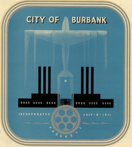
How Cool is my home town (Burbank, Calif.)? Sure, “Beautiful Downtown Burbank” is where Rowan & Martin’s Laugh-In was taped, but it was also (from 1928) the headquarters city of Lockheed Aircraft Co., as reflected in the city seal.
The entertainment industry was also represented, with the circular bit in the bottom-center — a film reel.
I found it online, but after extensive online searching could only learn the seal was used “in the 1940s,” so I popped it onto Facebook and asked readers if anyone knew more about it.
Bingo
Sure enough, within an hour reader John in Pennsylvania popped back with a link* to a historical report about Burbank, and from that I learned that the city seal was created by the Walt Disney Studios, which are also headquartered in Burbank, just down the street from the hospital where I was born.
Disney’s design was adopted in 1946 and apparently used until 1978, so I was “born under” that gorgeous art deco seal. (But I sure don’t remember it.)
At least, my home town was cool when I was born there: their present-day seal (below) is nowhere near as arty. Both designs, at least, soundly beat the original seal from 1911: that featured a …misshapen cantaloupe. Really. But that’s OK: that was long before cities had really discovered branding!
1911
The Original, giving homage to local agriculture: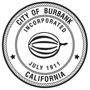
1931
Its Replacement is much more interesting, showing aviation’s important impact on the city — Lockheed moved to Burbank in 1928, and eventually employed, at its World War II peak, about 94,000 people — nearly 35,000 of them women in those “Rosie the Riveter” days: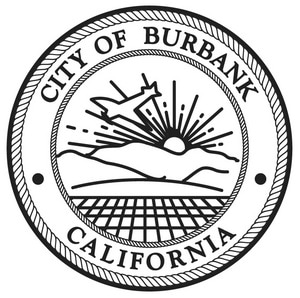
1978 to Present
The Current Seal, which replaced the Disney design, is decidedly boring, though it still features aviation. Now the entertainment industry gets equal billing — along with city hall: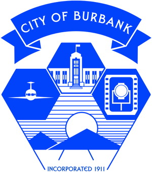
I’ll leave it to the comments to come up with the grand lesson for all of this!
Thanks to Wes Clark’s Burbankia page for the historical seal designs.
* The historical report, City of Burbank: Citywide Historic Context Report, (September, 2009) is here — 12.3 MB PDF, via the Los Angeles Conservancy.
As I Revisit This Page in 2026, I thought that Burbank should simply have politely asked Disney to update the time-honored art deco seal to reflect the 21st century. But considering city officials gave the company the finger, it’s too late for that now. They continue to use the uninspired blue shield. What a waste!
– – –
Bad link? Broken image? Other problem on this page? Let Me Know, and thanks.
This page is an example of my style of “Thought-Provoking Entertainment”. This is True is an email newsletter that uses “weird news” as a vehicle to explore the human condition in an entertaining way. If that sounds good, click here to open a subscribe form.
To really support This is True, you’re invited to sign up for a subscription to the much-expanded Premium edition.
The Disney seal is art but obviously a politician would never recognize that.
—
Right. But the biggest sin? No city hall on a par with other industry — they were ignored. Can’t have THAT! -rc
You say “city hall on a par with other industry”, yet when I look at the seal it appears that city hall is superior to other industry.
—
It gets the same amount of space, but yes, it’s indeed in the superior position. They think highly of themselves. -rc
I have fond memories of Burbank, especially times with relatives there; watching planes taking off and landing; and even going to a market and finding it closed because of the blue laws!
Hmmm. I wonder how much of the taxpayers money is “invested” in branding cities and towns in this day and age…in comparison to other competing budgetary needs that would benefit the people of the area more?
—
Branding does pay off. The typical scenarios are bringing in tourists (who spend money and then leave), and bringing in businesses (who create jobs and pay taxes). -rc
Please share this with Heraldry of the World.
This is a website dedicated to heraldry throughout the world and they have an extensive section dedicated to municipalities. Sadly Coats of arms for the United States are lacking. If you would give me permission I will reach out to them, but you did the work, not I.
—
I am happy for you to send the URL to anyone you think might have interest. Sending emails to folks to promote my site is spam. -rc
All the city vehicles had to have the seals changed as well as all the paper work. The year pins given to employees at each 5 years of service had the seal as well, I have both. I hated to see the old seal go I thought it had a lot of history going for it.
I remember that seal. It was on stationery, plaques, vehicles…. My mom had a hugely gaudy plaque she was presented for her years of service as Chairman of the Police Commission. It had the seal too. It was a terrific design. One day they’ll realize they blew it by retiring that one. How many cities have a seal designed by the Disney Studio? Hmmm???
Underneath the film reel on Disney-made seal it says “PROGRESS”.
Interestingly enough, it is missing at the newest seal. I wonder why… 🙂
—
The opposite of PROGRESS is CONGRESS, so we’re back to politics again. -rc
Very nice bit of history there, it’s always interesting to follow the life of a whole city through such imagery.
I have to say I don’t dislike the new seal at all. Sure, the 40’s one has that reassuring “good old times when everything was right” look to it, and I love Art Déco… but it does also have that post-WWII “massive forceful optimism” feel. You know: BIG industry, BIG plane, PROGRESS. WE RISE ABOVE ALL.
In the newer one, everything seems less menacing: citizens, industry, nature, all working together as in a beehive, in a calmer blue.
I’m sure the previous seal didn’t look menacing at all back then (or now, to many!) Funny how styles can change meaning so much. 🙂
Any idea why they quit using the Disney one? Maybe enough people in Burbank will read your story and petition to bring it back.
—
No, I didn’t find anything about why they changed it in 1978. No doubt, though, that if there were enough residents upset with it, they would have made an uproar at the time. -rc
The U.S. Navy has done a dumb-down of logos as well. Many of the historical command logos were designed by folks at Disney, Warner Brothers, and even had Felix the Cat. Now, for some reason, the brass has started involving heraldry designs as if we were the Royal Navy. The older designs are simple and easily identifiable, not so the new ones which all look the same at five feet.
Councils, whether city, municipal, county, or shire all have an air of self congratulation about them.
Signage welcoming me to a particular local government area is one of the largest wastes of money that I can think of, local government seals, logo and other branding follows a close second. Local governments by their nature are a monopoly provider — they collect local taxes from locals, and they spend that money on local services. The locals have no real choice in that matter apart from attempting to influence the policy of the local government body.
Branding is usually a feature of competitive industry where the providers of merchandise or a service are seeking to obtain the custom of the public. Local government has no such requirement. A seal or letterhead are used to signify the authenticity of the document, but this use is now dying out — this leaves me scratching my head as to why local governments need a logo, a brand or a seal at all.
I can appreciate some like to have a logo. Fair enough. But such logos should be immune to marketing types who come in “to freshen up the brand” — many local governments turn over their logos and seals far more often than Burbank.
When we moved to Glendale from Los Angeles in 1966, our property had a “guest house”. The structure had originally been a garage, but was converted into a residence in 1940 according to the building permit. The previous owner told my parents that several families had lived in the guest house over the years, all of them with their livelihoods from Lockheed.
—
I would imagine in the 40s there was quite a shortage of housing as Lockheed really geared up, as with any boom town. -rc
I like the art deco one. Maybe it went from modern to dated at some point, but now it’s… retro?
—
I prefer “classic”. -rc
The bright color of the present one looks to me like it was designed to be displayed on law enforcement vehicles. “Classic” is the best descriptor of the Disney design.
I frequently watch Johnny Carson reruns as his monologs usually put me to sleep. He often brought up that the show was actually produced in Burbank.