
This post was inspired by a question from Premium reader James in Toronto, who asked about the logo after he read an old post about how the This is True title came about:
Something that I’ve thought about occasionally, but not bothered to ask for whatever reason, is your choice of not only the font, but the colour of the title. I’d thought there was something familiar about it, and suddenly remembered one day recently why; a book of “speculative fiction” was published in Britain in 1971 called “The New SF”, compiled and edited by Langdon Jones. The letters SF appear to be the same font/colour as your choice! I probably can’t attach an image here, so you will have to search that title to see it.
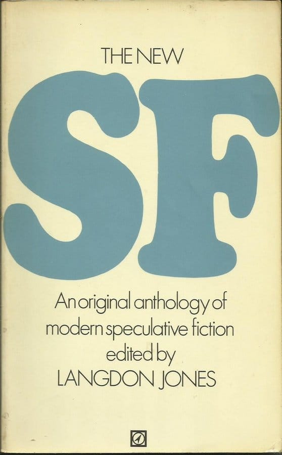 The short answer is no: True’s logo wasn’t influenced by that book since I’d never seen it before. It was indeed published by Arrow in the U.K., in 1970. Its “SF” is blue, but not the same shade. Its font is quite similar to the one I use, but it looks narrowed to fit it on the cover in such a large size. You can still find used copies on Amazon *.
Of course, there’s a longer answer. 🙂
The Longer Answer
I’ve always designed the type logos myself for my own creations. I will hire out more graphical elements, like the “Award” trophy for the True Stella Awards, but as a word guy I tend to want to emphasize the title with wordmark logos. The New York Book Publisher liked that Stella graphic enough that they used it on the cover of my book when they published it, so it got double duty.
Here is the progression of True’s logos: they didn’t start with blue! (Click to see larger.)
2000: I switched the font to Cooper Black. I wanted it to be in italics, but the font package I got didn’t have italic for this face, so I faked it by tilting the letters in my graphics program.
2008: “Randy Cassingham’s” is added to help tie True, Stella, and other projects together a bit more.
2012: I switch the red for blue, for the reasons discussed in the text. The drop shadow is made a bit more subtle.
2021: The drop shadow is made even more subtle. It works, but in very small sizes it’s so subtle as to be invisible.
2024: It occurred to me early this year that I really liked the original embossed-style shadow, which works nicely in smaller sizes, and switched back to that. This graphic, of course, is a PNG.
Since the highest resolution logos are used for print, they’re done in CYMK. The red was 100% magenta + 100% yellow. The blue is 100% cyan + 20% magenta. The 2012 is the same shade of blue, but the heavy shadowing makes it appear darker. Online, RGB is more common.
Why the Switch from Red?
It was a tough choice to switch from red. Back in the mid-90s, the red worked nicely since the common image format was GIF (pronounced, according to its creator, “jiff” — like the peanut butter). It held the shade very well. But when JPG became ascendent, partly because it could be heavily compressed, the logo, by then with a lot more red, really started looking like crap …especially when Facebook really took off.
I had kept the quality up by using PNG format, which uses lossless compression, but Facebook would switch it to JPG and compress the file aggressively, even though JPG compression is “lossy” and even if the resulting highly compressed JPG was larger than the original PNG file! Red is particularly affected by compression — it looks bad.
Not wanting my logo looking bad, I switched it to blue, which is my favorite color anyway.
So there you go: the entire story!
Written aboard ship travelling from Belfast to Amsterdam.
– – –
Bad link? Broken image? Other problem on this page? Let Me Know, and thanks.
This page is an example of my style of “Thought-Provoking Entertainment”. This is True is an email newsletter that uses “weird news” as a vehicle to explore the human condition in an entertaining way. If that sounds good, click here to open a subscribe form.
To really support This is True, you’re invited to sign up for a subscription to the much-expanded Premium edition.
My favorite part of this story?
“Written aboard ship travelling from Belfast to Amsterdam.”
—
Comment approved from somewhere in the English Channel. -rc
No logo for ‘This Just In’?
—
Good question, and nope! TJI never had a web site, and it was back in the text-only email days. By the time the first book came out, TJI was already renamed to This is True. -rc