
A story in this week’s issue needs a lot more room for explanation, not to mention a full-sized copy of the graph involved. First, let’s start with the story, from True’s 17 May 2020 issue:
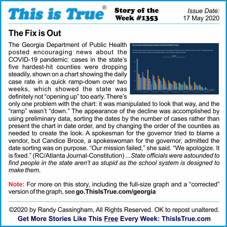
That said, the newspaper did not publish, nor could I find, the “corrected” graph. In fact, I really had to dig to find the original! I couldn’t believe the AJC would publish a lengthy story about a manipulated, state-issued graph without including a copy of the graph for readers to see for themselves! What I found is below.
The Atlanta Journal-Constitution noted the DPH changed the graph “after more than a day of online mockery, public concern and a letter from a state representative.” They didn’t publish that graph either.
Slamming the State
The AJC was pretty scathing in their report on what they called an “unforced error” at the hands of the state’s Department of Public Health. They say “observers” have “noted sloppiness in case counts, death counts and other measures that are fundamental to tracking a disease outbreak.”
Further, they continue, “DPH data issues caused confusion over whether novel coronavirus deaths had topped 1,000 — they are now more than 1,490*. The agency erroneously posted at least twice that children died.”
*(As of the date of the story’s publication, May 13.)
“Where does Sunday take place twice a week? And May 2 come before April 26?” they said at the top of their story. “The state of Georgia,” they said, in their “latest bungling of tracking data”.
But it wasn’t just the newspaper editorializing: they quoted others, too.
“It’s just cuckoo,” said state Rep. Scott Holcomb (D-Atlanta). “I don’t know how anyone can defend this graph as not being misleading. I really don’t.”
I don’t either.
Then there’s State Rep. Jasmine Clark (D-Lilburn), who has a Ph.D in microbiology and molecular genetics, who pressed the point even harder. “I have a hard time understanding how this happens without it being deliberate,” she said. “Literally nowhere ever in any type of statistics would that be acceptable.”
And she’s right.
The newspaper says Dr. Harry J. Heiman of the Georgia State University School of Public Health called the doctoring of the chart “criminal,” and that the agency has shown a pattern of reporting misleading data. My take:
I’ll say it explicitly: I believe the state purposefully manipulated the chart to give the false impression that the Covid-19 cases in the state were ramping down to justify “reopening” businesses. Who at the state is responsible is another question, but clearly the manipulated chart serves the governor’s narrative.
The Graphs
Let’s get to those, so you can see what all of us “observers” mean. (Click each if you want to see them larger. Once I had a lead on the chart I grabbed the largest one available, and the second is based on that too.)
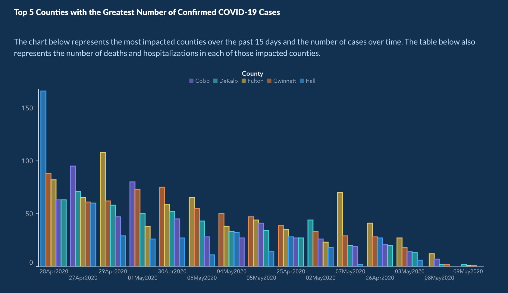
I give them a little credit in that they didn’t hide the dates completely. My guess: whoever was tasked to create the chart insisted the dates be included.
“But Randy,” you might be tempted to say. “The last two days really are small by comparison. Doesn’t that show a decrease?” Maybe, but we won’t know until the data are updated: “counts for recent dates are often a fraction of what they turn out to be when the data is more complete,” the AJC reports. I have not seen any updates in those specific numbers to be able to say either way.
It was a PITA, but I pulled the graph into my graphics software to cut each day out and rearrange them in date order. I didn’t try to change the order of the bars within each date as would be proper, since that would have been a nightmare of a job. Still, you’ll get the basic idea:
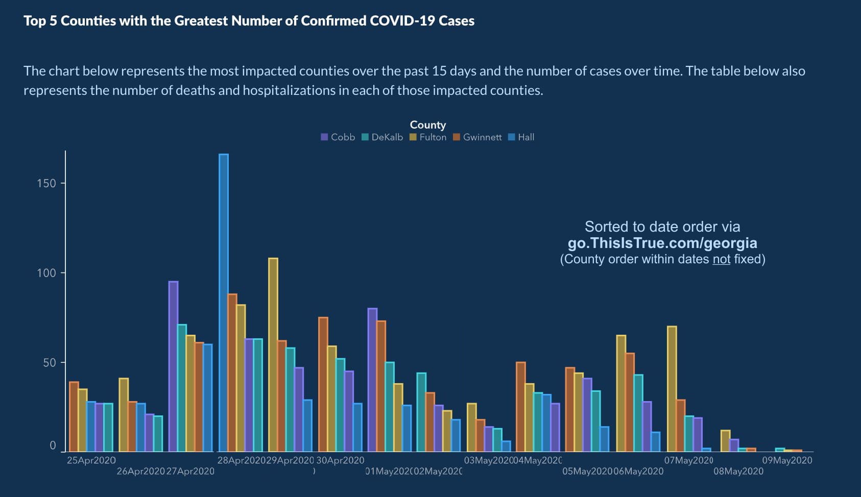
Just like that the “downward trend” is gone. If anything the trend is up starting on May 4 (depending on the final numbers for the later dates).
More Details
True’s retelling of the story notes “Candice Broce, a spokeswoman for the governor, admitted the date sorting was on purpose.” That’s my summary of this sentence from her Tweet about the fiasco, which is also embedded in the AJC’s story: “The x axis was set up that way to show descending values to more easily demonstrate peak values and counties on those dates.”
Separately, Broce told the newspaper that “We are not selecting data and telling them how to portray it, although we do provide information about constituent complaints, check it for accuracy, and push them to provide more information if it is possible to do so.”
Even the Wall Street Journal sneered at the fiasco behind the state’s Covid data reports: they “dubbed [Gov.] Kemp’s controversial decision to begin reopening, ‘The Georgia Model’,” the AJC reported.
The newspaper did get one Republican to weigh in on the matter, State Sen. Kay Kirkpatrick (R-East Cobb), a physician who was treated for Covid-19 and, obviously, recovered. “I don’t feel there’s any intention,” she said, “to mislead anyone or present [the data] in a way other than how they are.” Apparently, she didn’t actually look at the chart, let alone the actual trend.
The newspaper had a good bottom line by quoting Prof. Joseph Cappella, an expert on public health communication at the University of Pennsylvania’s Annenberg School for Communication. Such data presentations “need to be clear, they need to be consistent, they need to be credible, and they need to be apolitical,” he said.
Yep: right again.
– – –
Bad link? Broken image? Other problem on this page? Let Me Know, and thanks.
This page is an example of Randy Cassingham’s style of “Thought-Provoking Entertainment”. His This is True is an email newsletter that uses “weird news” as a vehicle to explore the human condition in an entertaining way. If that sounds good, click here to open a subscribe form.
To really support This is True, you’re invited to sign up for a subscription to the much-expanded Premium edition.
Reminds me of last year when the Trump White House doctored the tropical cyclone forecast track for Dorian to make it appear that it was going into southern Alabama. It did not; it actually took a turn to the NNE just before reaching the coast of Florida. Here is a BBC story about it.
—
Oh, I definitely remember that. -rc
Welcome to Georgia, Randy! This is not the first sketchy thing done by our latest state administration.
The ancient curse comes alive: “May you live in interesting times.”
—
Don’t I know it! My editorial Make Cheating Wrong Again about the trooper scandal was just three months ago, even if it does feel like a lifetime…. -rc
Georgia’s practice of reporting newly identified Covid-19 cases on the day of onset of symptoms rather than on the day of confirmation is distorting enough as alluded to by the comment that recent days’ data frequently changes (always goes up significantly). Until a week or two has passed those numbers are incomplete and meaningless under Georgia’s methodology — they really shouldn’t be reported at all.
Actually, day of onset of symptoms, if reported clearly and consistently, would be a great metric, smoothing out a lot of reporting issues.
But then you get aberrations like people who hide symptoms because they can’t afford time off work….
They ABSOLUTELY lied, with malice aforethought; I’ll want some heads on my desk tomorrow morning. And I don’t even live there.
The prosecution should hire Ed Tufte — he actually had a seminar scheduled for Atlanta, and I was gonna go except corona.
—
Tufte is a widely acknowledged expert on data visualization. I’ve had a hardcover of his seminal book The Visual Display of Quantitative Information since my JPL days. -rc
And THEN we have what happened in Florida (sigh….you KNEW they’d show up): a scientist worked for weeks to give accurate data when it comes to coronavirus…and then she was told to manipulate said data. She refused. And she was fired.
A scientist??? You need to check out what she really was. A data clerk charged with inputting data from the real scientists.
—
I checked out who Jones really is — did you? Or did you just swallow what partisan media claimed? Here’s what’s true: Jones was no mere typist, but rather was the GIS (Geographic Information System) Manager at the Florida Dept. of Health. She has both bachelors and masters degrees in science — geography, perfectly appropriate for her position — and has completed the coursework for her Ph.D in (yep!) data science at Florida State University; she has apparently not finished her dissertation, so does not yet warrant being called “Dr.”
She has also published research on hurricane modeling, with is also consistent with GIS work. The governor “launched” the data portal Jones built with standard GIS software live on national television, and it was praised by the White House. Whether she was actually asked to “manipulate” the data as claimed remains to be seen, but she was clearly no simple “data clerk,” and slandering her as such drastically weakens any argument that her firing was justified, rather than political retribution. -rc
Thank you, Randy!
Sadly, though, (to me) it seems that Gary is one of those who has made up their minds and neither truth nor facts will sway them.
—
Which is probably why he’s not a This is True subscriber. -rc
“Statistics are like bikinis. What they reveal is suggestive, but what they conceal is vital.” –Adam Levenstein
One of the absolute best books i ever read in graduate school, in the ’70s, was “How to Lie with Statistics. Probably out of print now. But I sure don’t remember any chapter about reorganizing the data dates. Wow.
Actually, Matthew in Minneapolis has an interesting point. There would be a neat comparison of graphs if 2 sets of data were plotted: “date of onset” and ‘date of confirmation”. Shapes should be the same, yielding different information, assuming the data were entered in some form of consistent consecutive dates.
—
How to Lie with Statistics is still in print (since 1954). It was one of my college textbooks also: it has helped me not be a total fool when it comes to statistical info. Author Darrell Huff died in 2001, but the publisher has been reissuing it as needed: the latest edition came out in 2010. -rc
I’m really puzzled about this degree of amateurism. If they had chosen to show the graph in its full length (i.e. as of January 1st, 2018) everybody could have seen immediately that the crisis has long been gone and the reopening as fast as you can is overdue for two years! It’s astonishing how fundamentally wrong the other 7.5 billion people (those living outside of Georgia) can get it.
And had they started the graph on January 20th, 2017 they could have proven that good old (and always very very unfairly treated) Donnie happened to inherit also this Covid problem from his lousy predecessor, but that since the one and only took over infections have gone down quickly and sustainably. By the way correcting the unemployment graph the same way would increase their boss’s chances of reelection considerably, and applying that new order to everybody’s lifetime weight stats would turn the workout industry bankrupt overnight….
To me it doesn’t seem to be a statistical mishap: that is nothing less than an intellectual insult to the people of Georgia. And there is clearly a very promising political talent showing up in good time for taking over (in 2025) as the next Liar in Chief (for your otherwise indeed fantastic country). God bless America!
Sitting north of the border in Canada, the USA looks like a nation of morons, nut bars, racists, and incredibly selfish people.
I have to remind myself that it is also a nation of amazing creativity and accomplishments (e g. The Apollo program) as well as dedication (any dairy, chicken, or egg farmer). But sadly those are the tiny minority.
—
Actually, the vast majority of Americans are amazing people, just like the vast majority in other countries. Don’t be fooled by the obliviots, who try to stand out by making a lot more noise. -rc
I’m a native Floridian and wish I could be justifiably insulted by Jennifer’s comment, but she’s right. Based on the recent poll results and reports by reliable news media, live congressional hearings, and presidential news conferences that I’ve seen, it looks to me like about half of us are morons, nut bars, racists, and incredibly selfish people, although most of my friends and neighbors are not. I can’t trust the other customers at my grocery store to even TRY to follow the physical distancing guidelines, and I’m afraid that our current president — for whom I and the majority of the people who voted in our 2016 general election did not vote — and his followers will tear this nation apart with the unwitting assistance of the coronavirus that causes Covid-19.
—
For those who have never actually looked it up, the results of the 2016 general election was 62,984,828 votes for Donald Trump, and 65,853,514 for Hillary Clinton. -rc
For the sake of accuracy, I’m actually a native of the USA so have lived on both sides of the border. And appears that the USA has gone off the rails especially in the last 6 or 7 years. I am astounded at those scenes of obliviots waving firearms around at a state legislature. Is this the way civilized people conduct themselves???
Maybe everyone needs to watch that movie about 24 hours with no rules (the name escapes me).
There are so many ways to take the same data and leave viewers with very different impressions. For instance, I took your version of the graph which you amended to be in ascending date order, and simply reversed each clump of daily bars so that the smallest bar (least deaths/hospitalizations) is on the left and the largest bar (most deaths/hospitalizations) is on the right.
Same data just presented in a way which (to my eyes at least) gives more of an impression of increasing cases each day, even though I know it doesn’t.
Reminds me of the quote: There are “lies, damned lies, and statistics”….
“unforced error” — That’s not an “error.” That’s an outright lie. It couldn’t have been more fraudulent if it had been made with totally random numbers.
It’s sad when citizens have to verify information on government websites is accurate.